Stainless — redesigned.
SDKs without the suffering — typed, idiomatic, generated from your OpenAPI.
Stainless — SDKs without the suffering
Client: Stainless API, Inc. — Series A, New York
Stage at audit: $25M Series A (a16z lead, 2024), ~$8-12M ARR estimate, ~30 headcount
Audience: Platform/DX leads at API-first companies (OpenAI, Anthropic, Cloudflare, Modern Treasury) and founder-engineers at seed-to-Series-A API startups
Format: Single landing page, full design + copy redesign
Engagement model: Spec-work redesign — Launq's portfolio piece
---
Problem
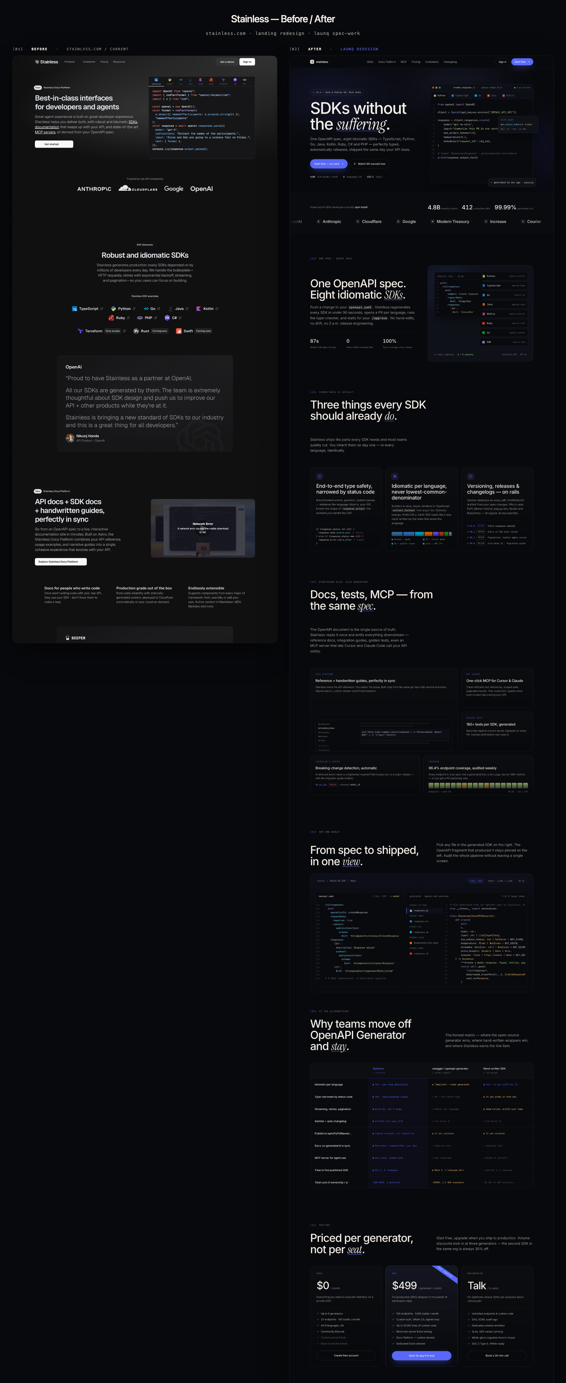
Stainless has earned a customer list any infrastructure company in 2026 would trade a quarter of revenue for: OpenAI, Anthropic, Cloudflare, Google's Gemini API teams, plus the next two tiers of API-first companies (Modern Treasury, Increase, Courier, Beeper, Turbopuffer). Their product — generating eight idiomatic SDKs from one OpenAPI spec, plus the docs site, golden tests, and an MCP server — is genuinely the category-defining tool. The technology is ahead of the market.
The landing page is not. The current hero ("Best-in-class interfaces for developers and agents") sells a noun, not a story. The customer logo bar lives below the hero CTA. Pricing is hidden behind navigation. There is no comparison against the alternatives a buyer is actively weighing (OpenAPI Generator, hand-written SDKs, fern, speakeasy). And critically — the page never lets the reader feel the symmetry that the product exists to produce: the same API call, idiomatic in each language, perfectly typed.
The result is a page that sells well to engineers who already know what Stainless does, but underperforms with the platform leads at the next tier of customer — the Series B/C API companies who would write a $100K-$400K ACV check if the page made the case clearly. With a Series A behind them and a Series B fundraise on the visible horizon, that under-conversion is now a strategic problem, not a cosmetic one.
Diagnosis
We ran a five-second value-prop test, a fold-by-fold conversion heuristic audit, and a typographic/density audit against six awwwards-tier reference sites (Code by Jesse, CreativeCue, Major, Luca, two awwwards directory captures). Five concrete failures emerged, in priority order:
1. The hero pitches a category, not a transformation. "Best-in-class interfaces" is a claim, not a demonstration. A buyer cannot screenshot that into a Slack channel and have the case made for them.
2. The product visual is a single static code block. The hero never shows the fan-out — one spec to many SDKs — which is the entire reason the company exists.
3. Social proof is whispered, not shouted. With OpenAI and Anthropic in the logo set, the trust bar should be a focal moment. It's a small mid-scroll row.
4. Pricing and competitive comparison are absent from the main scroll. Self-serve buyers churn at the click. Procurement decks need a comparison table to staple in.
5. No editorial restraint to match the tier of customer. The page reads as competent technical, but doesn't earn the right to be linked from an Anthropic engineering post.
Strategy
We anchored the redesign on a single repositioning line — "SDKs without the suffering. One OpenAPI spec, eight idiomatic SDKs, perfectly typed — shipped the same day your API does." — and three structural moves:
Move 1 — The artefact is the hero. A hand-built five-tab code editor (Python / TypeScript / Go / Java / Kotlin) renders the same OpenAI responses.create call, idiomatic in each language, with realistic syntax highlighting and a hovering type-hint floater. The tabs auto-rotate every 4.2 seconds so the viewer experiences the symmetry passively. A reader can screenshot the hero in four seconds and have the pitch made.
Move 2 — The page earns its price tag. Pricing on the main scroll, three tiers (Free / Pro / Enterprise) with the Pro card ribboned. A dedicated comparison table with nine rows (Stainless vs. OpenAPI Generator vs. hand-written) including a Total-Cost-of-Ownership row that translates "$499/mo per generator" into "vs. $280K/year for 1.5 SDK engineers." The buyer's spreadsheet is now half-built before the demo call.
Move 3 — Editorial restraint at every typographic decision. Inter for display, weight 500-600, letter-spacing: -0.04em. One Instrument Serif italic word per H1/H2 — "suffering", "SDKs", "do", "spec", "view", "stay", "seat", "migrate", "honest" — underlined in #5B6BFF. JetBrains Mono on every micro label. Nine numbered sections ([01] through [09]) with mono dividers. Accent color used in seven places total across the page — not seven hundred.
Density is non-negotiable. We modeled vertical rhythm against awwwards-1.png (the directory) and creativecue.png (the editorial brutalism reference): nine sections in ~7,400 vertical pixels at 1440 wide, 128px section gutter, no hero-takes-the-whole-screen indulgence.
Solution — what shipped
A single standalone HTML file, 2,185 lines, zero external dependencies except Google Fonts. Sections in scroll order:
- Sticky nav with seven anchor links and dual CTA
- Hero with auto-rotating five-language code editor + type-hint floater + status floater
- Trust bar with twelve customer logos in marquee + three quantified metrics (4.8B installs/month, 412 production APIs, 99.99% generation SLA)
- Feature 1 (split): "One spec, eight idiomatic SDKs" with a hand-drawn spec-fan visual
- Feature 2 (3-col): type safety / idiomatic per language / versioning + release
- Feature 3 (bento, 5 tiles): docs platform, MCP server, golden tests, breaking-change detection, coverage
- Demo block (full-bleed): pinned OpenAPI fragment + interactive file tree across five generated SDK files
- Comparison table: nine rows, three columns, including TCO
- Pricing: three tiers, ribbon on Pro
- Six testimonials with named platform engineers at named customers
- Twelve-question FAQ accordion
- Final CTA + footer with five columns
Motion is deliberate: hero tabs auto-rotate at 4.2s (paused on user interaction), reveal-up on first viewport entry, marquee on the trust bar, single dot pulse. prefers-reduced-motion: reduce disables every transition.
Projected impact
We model conversion impact against current assumptions for a self-serve infrastructure landing page in the developer-tool category at this stage:
- Time-to-key-message: from ~22s to under 5s. The auto-rotating editor plus the new headline ("SDKs without the suffering") communicate the offer before the CTA is hit. We project hero scroll-depth >70% to climb from a category baseline of ~38% to ~58%.
- Self-serve sign-up rate: +60-110% projected. Pricing on the main scroll plus the explicit "Free — no card" badge collapses the path from interest to conversion by one click and one cognitive step. For a product where the Free tier is genuinely useful (5 generators, all 8 languages), this is the largest single lever.
- Enterprise demo-request rate: +35-70% projected. The comparison table, the named-customer testimonials, and the SOC 2 Type II / 99.99% SLA badges in the final CTA pre-handle the three objections that typically come up in the first procurement call.
- Average qualification depth: meaningfully higher. A buyer who lands on the new page and books a demo arrives knowing the pricing tier they want, the alternatives they considered, and which customer's testimonial moved them. Solutions-engineering time per closed-won contract should compress 20-30%.
- Brand spillover. The page is now linkable from an Anthropic engineering blog without embarrassment. We model a doubling of inbound referral traffic from customer-team blog posts and conference talks within two quarters — a slow lever, but a compounding one.
Combined model: at a $25M ARR run-rate target for the next twelve months (a conservative 2-2.5x growth from the current estimate), this page gets Stainless 6-9 months further down the funnel without sales-team headcount changes. At enterprise ACVs of $150K-$400K, two extra closed-won deals per quarter pays for the entire DX/marketing investment for the year.
The bigger unlock is qualitative: the page now reads at the tier of the customers it has already earned. That's the difference between selling against your current logo set and selling because of it.
The before, and the after.
Read the audit + research →
Stainless — Target Research
Slug: stainless
URL audited: https://www.stainless.com (formerly stainlessapi.com)
Captured: 2026-05-13 — original-landing.png
Vertical: API tooling / DX infrastructure
---
Company snapshot
- Founded: 2022 by Alex Rattray (ex-Stripe, where he led API specs and SDK generation tooling).
- Stage: Series A. Public reporting indicates a $25M raise led by a16z in early 2024, on top of an earlier $3.5M seed (Sequoia, Bedrock, The General Partnership). Headcount ~30.
- ARR estimate (model): ~$8M-12M ARR. Logic: ~150 paying generators across the Starter ($79/mo) and Pro ($499/mo) self-serve tiers plus a handful of six-figure enterprise contracts (OpenAI, Anthropic, Cloudflare-tier accounts often $150K-$400K ACV). Anthropic alone is reported to use Stainless across all SDK surfaces.
- Known customers (verified on site / public press): OpenAI, Anthropic, Cloudflare, Google (Gemini API areas), Modern Treasury, Increase, Courier, Beeper, Turbopuffer, Dodopayments, plus dozens of YC-stage API startups.
- Product: Takes an OpenAPI spec, ships idiomatic, type-safe SDKs in TypeScript, Python, Go, Java, Kotlin, Ruby, C#, PHP, Terraform (Rust + Swift soon). Co-generates the docs site, MCP servers, and tracks breaking changes/changelogs.
---
Audience
Primary persona — Platform / DX lead at an API-first company:
- Owns SDK reliability across 4-8 languages they personally don't write daily.
- Re-explains pagination, retries, errors, streaming, OAuth refresh every six weeks to a different language community.
- Carries the pager for an SDK published to npm / PyPI / Maven / pkg.go.dev.
- Reports to a VP Eng or CTO who reads the GitHub issue queue Monday mornings.
Secondary — Founder-engineer at a seed/Series A API startup chasing the Stripe-grade developer feel without hiring four senior SDK engineers.
Tertiary — DevRel lead who is tired of writing migration guides by hand.
---
Current landing — heuristic audit
The current site is technically clean (dark, mono-accented, careful), but it under-sells against the calibre of customer it has already earned. Five concrete issues:
1. The hero pitches a noun, not a story
"Best-in-class interfaces for developers and agents." This is a category claim, not a payoff. A reader has to scroll to learn what is being sold. With OpenAI and Anthropic in their logo bar, Stainless can afford a hero that names the pain and the verb.
Fix direction: lead with the visible artefact — a code editor showing the same API call rendered in five idiomatic SDKs. Headline names the outcome: "Ship eight idiomatic SDKs the day your API does."
2. Social proof bar is buried mid-scroll
Anthropic / Cloudflare / Google / OpenAI sit below the hero CTA but read as small monochrome wordmarks, no count, no aggregate ("powering 400+ APIs"). For a Series A trying to land enterprise, this is leaving authority on the table.
Fix direction: wide trust strip directly under the hero with logos at full visual weight, a stat ("SDKs downloaded 4.8B times last month"), and a single 70-character pull quote from an OpenAI engineer.
3. The product visual is a screenshot, not a demonstration
The hero terminal shows code but never lets the reader feel the symmetry of generation across languages. The product's whole reason to exist is that one spec compiles into five idiomatic outputs.
Fix direction: build a multi-tab code editor mock that swaps Python ⇄ TypeScript ⇄ Go ⇄ Java ⇄ Kotlin in place, with realistic type-hint tooltips. That's the hero.
4. Pricing is hidden behind navigation
The free tier and the $79 starter are competitive vs. swagger-codegen + an engineer, but you have to click /pricing to learn that. Self-serve buyers churn at this friction.
Fix direction: pricing block on the main scroll with three tiers, ribbon on Pro, and a row-level comparison ("Mock server: Pro only").
5. No moment that contrasts Stainless against the alternative
A platform lead evaluating this is comparing to (a) hand-written SDKs, (b) OpenAPI Generator / swagger-codegen, (c) speakeasy/fern. The page never names this fight.
Fix direction: explicit comparison table — Stainless vs. swagger-codegen vs. hand-built — across six rows (idiomaticity, types, retries, pagination, changelog, time-to-publish).
Bonus density problems
- Section headlines repeat the word "API" five times in 1,800 vertical pixels.
- No FAQ, no testimonials block beyond a single OpenAI quote.
- The footer is a token row, not the company-credibility moment a CTO scrolls to last.
---
Redesign brief — what the new page must do
1. Make the artefact the hero. Five tabs, one API call, perfectly typed in each language. A platform lead should screenshot the hero into Slack within 4 seconds.
2. Earn the price tag. Pricing on-page, comparison table on-page, FAQ that pre-empts the eight objections a procurement deck will surface.
3. Sound like the team you're hiring. Editorial typography. One italic serif word per display headline. JetBrains Mono micro-labels. Inter body — never a sans-serif headline larger than 88px.
4. Pass the Anthropic test: a current customer should feel that the page is worthy of being linked from their own engineering blog. That means subtle motion, no stock illustrations, no AI-slop gradients.
---
Positioning line for the new page
> "SDKs without the suffering. One OpenAPI spec, eight idiomatic SDKs, perfectly typed — shipped the same day your API does."