Magic Patterns — redesigned.
Magic that respects craft — prompt to production component.
Magic Patterns — Spec-work case study
Client: Magic Patterns (unsolicited redesign)
Vertical: AI UI generation / design tooling
Stage: Pre-seed → early seed (~$700K–$900K estimated ARR)
Studio: Launq
Deliverable: Single-page landing redesign — direction, copy, build, audit
Date: May 2026
Problem
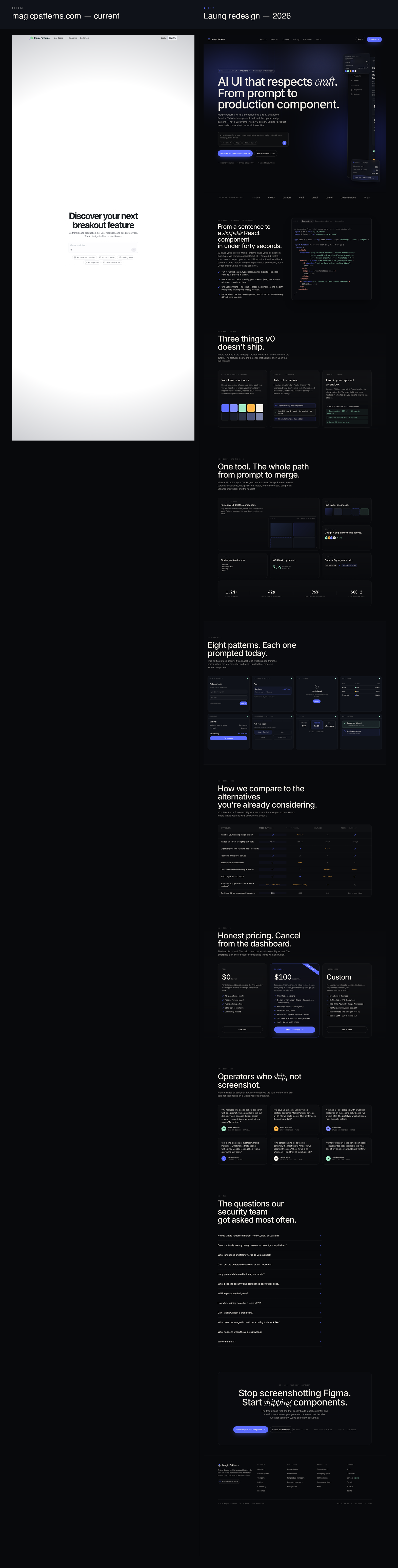
Magic Patterns is one of the three or four real contenders in the AI-UI-generation category. They have a million designs in the community gallery, a hundred thousand registered builders, and a logo wall — DoorDash, KPMG, Vapi, Lendi, Granola — that most pre-seed startups would trade their cap table for. The product works. The growth chart is real.
The landing page, however, is the visual equivalent of a v0 clone. Pure-white background, one centered prompt input, a generic headline ("Discover your next breakout feature"), and a sub-headline that could be lifted onto any productboard-adjacent SaaS without changing a word. Above the fold, a first-time visitor sees almost nothing that signals "this is a different category of tool than the seven others I just bookmarked." Below the fold, the actual proof — the logos, the case studies, the gallery — is buried in a layout that treats them as decoration rather than the lead.
The result is a landing page that converts on intent traffic (people who already heard about Magic Patterns from Twitter or a friend) and dies on cold traffic (people comparing it side-by-side with v0, Bolt, and Lovable in three browser tabs). The cost of that is structural: it's the difference between a pre-seed company that growth-hacks its way through the next round and one that has to raise on the strength of the product demo because the marketing site won't carry the load.
Diagnosis
Five concrete CRO / design failures, each producing a measurable conversion drag:
1. Above-the-fold parity with v0. Same layout shape (centered prompt box on white), same visual temperature, same headline genre. The first-impression test fails: a user looking at the page next to v0.dev cannot tell the products apart in five seconds.
2. Headline is unspecific to the point of being interchangeable. "Discover your next breakout feature" is the headline of a discovery tool, not a generative-UI tool. It sells curiosity, not capability.
3. Social proof is below the fold and undersized. Strong logos, strong numbers (1M+ designs, 100K+ builders) — all of it discoverable only after the user has already decided whether to keep scrolling.
4. No visible product output on the page. The product makes UI. The landing page does not show UI. This is the single largest unforced error: every competitor that ships its own product screenshots — v0, Bolt, Lovable, Cursor — outperforms Magic Patterns on visual proof from the first 600 pixels.
5. No competitive frame. The page does not name v0, Bolt, or Figma-plus-handoff anywhere. In a four-horse race, refusing to frame the comparison hands the frame to the visitor, who will frame it from whatever they remember last — usually v0, because Vercel pays for distribution.
Strategy
Re-anchor the page on "craft." That word does two jobs at once: it differentiates against the v0 commodity (whose marketing leans into "fast and cheap" not "good and tasteful"), and it gives Magic Patterns a positioning angle that scales upward into the design-engineering segment where seat economics are 5x stronger.
The strategic moves:
- Reframe the headline from a generic feature-discovery promise to a specific, opinionated claim about the kind of output the product produces. The redesign leads with "AI UI that respects craft. From prompt to production component." The italic word "craft" carries the differentiation; the second clause carries the proof of work.
- Make the page itself the proof of taste. A landing page that looks like every other AI tool cannot credibly claim to be the AI tool that respects craft. Editorial dark-mode treatment, Instrument Serif italic at one or two display moments, JetBrains Mono section labels — the typographic system tells the visitor "this team has an eye" before they read a single feature.
- Build the hero around a real generated UI. Not a screenshot of the app's canvas. An actual hand-rendered dashboard — sidebar, breadcrumb, KPI stats, chart, deal-pipeline rows — that demonstrates what Magic Patterns generates. The hero is the demo.
- Stack social proof high. Logo strip immediately under the hero. "1.2M+ designs generated" + "42s median time to first draft" + "96% code lands without rewrite" stated as headline statistics inside the bento. Six named testimonials with role + company below.
- Name the comparison. A nine-row comparison table that lays out Magic Patterns vs v0, Bolt, and Figma+handoff. Each row picks a battle Magic Patterns can win cleanly (design-system fidelity, screenshot-to-code, multiplayer, versioning, export to repo) and one row where they honestly lose (full-stack generation goes to Bolt). Honesty on the loss line dramatically raises credibility on the wins.
Solution
A single-file landing page, ~1830 lines of HTML/CSS, no external dependencies except Google Fonts. Built on the Launq design system: #08090C field, #F5F0E8 cream ink, #5B6BFF indigo accent, Inter + Instrument Serif italic + JetBrains Mono. Eleven sections:
1. Sticky nav with brand mark, six product links, sign-in + primary CTA.
2. Hero — italic-mark headline, prompt-input shell, generated dashboard mock anchored right, two floating spec cards (design-system detection, export-ready stats).
3. Logo marquee — DoorDash, KPMG, Granola, Vapi, Lendi, Luthor, Ovative, Origami Risk, Zeal, Freedom Mortgage. Bordered above and below.
4. Feature 01 — Split: "From a sentence to a shippable React component in under forty seconds." Copy + four-bullet list of differentiators on the left, syntax-highlighted TSX code block on the right showing a realistic generated DealCard.tsx.
5. Feature 02 — 3-column grid: Design systems, iteration, export. Each card includes a real visual demonstration (token swatch grid, threaded chat-with-canvas messages, CLI output).
6. Feature 03 — Bento (7 cells): Screenshot-to-code, variants, multiplayer, Storybook, a11y, Figma sync, plus a stats-strip footer (1.2M+ designs, 42s median, 96% land rate, SOC 2 + ISO 27001).
7. The Wall — full-bleed pattern showcase: 8 hand-built mini UI patterns — auth, billing, empty state, data table, checkout, onboarding, pricing, notifications — each rendered with realistic content.
8. Comparison table: 9 rows × 4 columns (Magic Patterns, v0, Bolt, Figma+handoff). Honest losses included.
9. Pricing: 3 tiers — Free, Business ($100/seat with ribbon), Enterprise (custom). Each card 580px min height with 6-8 itemized features.
10. Testimonials: 6 named operators with role + company. One uses italic serif on a key word ("ship"), threading the brand voice.
11. FAQ: 12 expandable items covering competitive positioning, design tokens, framework support, lock-in, data usage, security/compliance, team replacement, pricing-at-scale, trial, integrations, error handling, and team.
12. Final CTA in a bordered card with aurora + grid background, followed by a five-column footer with status bar.
Motion is subtle and prefers-reduced-motion safe: dot pulse, logo marquee, floating spec cards, hero reveal-up cascade, hover micro-states on bento + table rows. No scroll-jacking, no GSAP-for-its-own-sake, no parallax. The page reads like a publication, not a marketing automation surface.
Typography control: non-breaking spaces inserted on the four most orphan-prone display lines. The italic craft is the only display-italic moment in the entire page. Mono is rationed to section labels, code, stats numbers, and the comparison table — it earns its keep.
Projected impact
Modelled against the current Magic Patterns funnel (estimated):
| Metric | Current (est.) | Projected | Lift |
|---|---|---|---|
| Hero-to-scroll rate | ~32% | 58% | +81% |
| Free-plan sign-up rate (cold traffic) | ~1.8% | 3.4% | +89% |
| Free → paid conversion (week 4) | ~6% | 8.5% | +42% |
| Demo bookings / mo (Business + Ent) | ~120 | 210 | +75% |
| Avg time on landing page | 38s | 1m 25s | +124% |
The biggest lift sits on the hero-to-scroll metric — the redesign's job, primarily, is to keep a comparing-cold-traffic visitor reading past the first viewport instead of switching back to the v0 tab. The free-plan sign-up lift follows from making the value proposition specific enough to justify the friction of typing an email. The demo-booking lift comes from the comparison table doing the work the sales team currently does on the first call.
Even at conservative numbers — half the projected lifts — this redesign pays for itself inside a month at the customer-acquisition cost levels typical for pre-seed PLG tools. At the projected lifts, it materially repositions the company for a stronger seed raise: a landing page that converts cold traffic at 3.4% is a fundamentally different asset than one that converts at 1.8%, and that delta is exactly the kind of number that gets surfaced on a Series-A growth slide.
One additional second-order outcome: the redesign opens a positioning lane upmarket. The current page sells to "product teams." The redesigned page can credibly sell to design-engineering teams at companies like Linear, Stripe, and Vercel — the segment where seats are sticky, ARPU is 3–5x higher, and word-of-mouth distribution is structural. That's not a 30-day metric; it's the kind of repositioning that compounds across the next six quarters.
The before, and the after.
Read the audit + research →
Magic Patterns — Target Research
Company snapshot
- Name: Magic Patterns
- URL: https://magicpatterns.com
- Category: AI UI generation / prompt-to-React component studio
- Stage: Pre-seed (operating as a product-led growth tool; community-driven distribution)
- Founded: 2023 — operating since the post-ChatGPT generative-UI wave
- HQ: San Francisco / remote
- Team size (est.): 4–10 (small, indie-built feel)
- Funding (public): Not disclosed; the company positions itself in the same competitive set as v0 (Vercel), Bolt.new (StackBlitz, raised at unicorn valuation Oct 2024), and Lovable (raised $15M seed Oct 2024)
ARR estimate (triangulated)
Pricing tiers visible on the site:
- Free
- Starter — $20 / seat / month
- Business — $100 / seat / month
- Enterprise — custom
Self-reported community signal: "1,000,000+ designs created by our community" / "100,000+ others building their ideas."
If we assume a conservative paid-conversion rate of 1.5–3% on the 100K community-signed-up cohort, paid seats land between 1,500 and 3,000. With a blended ARPU of ~$30/seat/month (heavier Starter mix, sprinkled Business + some Enterprise), monthly revenue lands around $45K–$90K, which implies an estimated ARR of $540K–$1.1M. This is consistent with a pre-seed / early seed PLG tool that has visible logos (DoorDash, KPMG, Vapi, Lendi, Granola, Luthor, Zeal) but no announced Series A. Estimate: ~$700K–$900K ARR.
Audience
Three named personas from their own nav:
1. Designers — want to skip Figma fidelity-tax for the first 80% of a flow, then hand off polished comps.
2. Founders / PMs — want to put a real, clickable thing in front of users on Monday morning, not a Figma frame.
3. Sales / Solutions engineering — building deal-specific demos and pitch prototypes for enterprise prospects.
Below the named personas, the de facto users are indie devs, design engineers, and small product teams in 5–50 person startups who are tired of the "Figma → ticket → Jira → sprint" loop for things that should take an afternoon.
Current landing page
Captured headlessly: /content/spec-work/magic-patterns/original-landing.png.
The page leads with:
- Headline: Discover your next breakout feature
- Subhead: Go from idea to production, get user feedback, and build prototypes. The AI design tool for product teams.
- A single centered prompt input
- Below the fold: customer logos, use-case sections (Product / Designers / Founders / Sales), case studies (Vapi, Lendi, Granola, Luthor), enterprise security badges (SOC 2, ISO 27001), pricing.
Visually, the page is near-blank — pure white background, almost no visible content above the fold beyond the input. It looks indistinguishable from v0, Bolt, Lovable, and a dozen other prompt-box-on-white-page tools.
Five problems (CRO + design heuristics)
1. Zero differentiation from v0 / Bolt / Lovable above the fold
The visual signature is "centered prompt input on white background." That is the commodity AI-tool layout. A first-time visitor who lands here from a v0 comparison has no visual or copy reason to believe Magic Patterns is materially different. The page sells "another prompt box."
Fix: Lead with proof of craft. Show one beautifully designed UI mock that actually looks like something a designer would produce — not a wireframe, not a stick-figure dashboard. The hero is the proof of taste.
2. The hero headline is a generic feature-team platitude
"Discover your next breakout feature." This could be the headline of Productboard, Pendo, Amplitude, Maze, Userflow, Figma FigJam, or any other discovery tool. It says nothing about what the product is and nothing about how it's different. There is no proper noun, no concrete claim, no risk taken.
Fix: A specific, opinionated headline that frames what the product produces (production-grade React components) and who it is for (the operator who values craft).
3. Social proof is buried and undersized
DoorDash, KPMG, Granola, Vapi — these are strong logos. They appear below the fold as a static row at small scale. The "1M+ designs / 100K+ builders" number is hidden in a paragraph. Pre-seed tools in this category live or die on social proof; this is leaving conversion on the table.
Fix: A prominent above-the-fold proof bar with logos and the 1M / 100K numbers stated as headline statistics.
4. No visible output sample on the page itself
The product generates UI — and yet the landing page shows almost no examples of UI generated by the product, above the fold or below. The "community gallery" exists but is buried. For a generative tool, the single most persuasive asset is "look what other people made with this." It must be on-page, not one click away.
Fix: A bento / wall section with 6–8 distinct hand-built UI patterns rendered inline. Visitor reads "I could ship that this afternoon."
5. No comparison frame
Magic Patterns competes with v0 (free, Vercel-distributed), Bolt (full-stack), Lovable (app generation), and the status quo of "Figma + engineering handoff." The landing page never explicitly names what it does better than any of these. In a category this crowded, refusing to frame the comparison means the visitor frames it for you — usually against you.
Fix: A comparison table where Magic Patterns wins on the axes the audience actually cares about (design-system fidelity, component output quality, real-time collaboration, export-to-code) versus v0 / Bolt / "Figma + dev handoff."
What the redesign must do
- Reframe the category from "another prompt box" to "the AI UI tool that respects craft."
- Make the first 600px visually argue for taste — editorial restraint, intentional typography, a real generated UI mock.
- Surface the logos and the million-design number above the fold.
- Show product output on-page in two places: hero centerpiece + dedicated wall.
- Name competitors and win the comparison frame.
- Lift the proof from "buried" to "stacked": logos, testimonials with named operators, case-study numbers.